
Redefining the Driver Experience for One Car
I led the strategic redesign of the One Car driver app to solve critical driver pain points like high cognitive load and income uncertainty. My user-centered approach delivered a more efficient, predictable, and engaging platform that boosted driver satisfaction.
The project's ultimate success was validated when its core design principles and features were integrated into the main Didi Chuxing app following their acquisition of the company.
My Role and Responsibilities
Role
Lead UX Designer
Time
Jan. 2015 - April. 2015 (3 Months)
As the Lead Product Designer, I was responsible for the entire design lifecycle of this project.
-Conducting user research and discovery to identify driver pain points and needs.
-Creating key deliverables such as user journey maps, wireframes, and prototypes.
-Leading the interaction design (IxD) and animation design.
-Facilitating usability testing sessions and iterating on the designs based on feedback.
Project Goals
With the new rider app successfully launched, Kuaidi ONE has seen exponential growth in private car-hailing requests. To meet this demand and capture a larger market share, an enhanced driver app is essential. Through interviews with executive staff, the primary objectives for this redesign project have been identified:
Reduce time spent selecting rides
Previous driver feedback highlighted numerous usability issues in the ride selection process, leading to unnecessary time consumption. The aim is to streamline this experience.
Increase online duration
To enhance the capacity for rider transfers, the app needs to incorporate appropriate incentive interactions for drivers, encouraging them to stay online longer.
Foster driver loyalty
Many drivers simultaneously offer services for Uber, Didi, and Kuaidi ONE. A key objective is to attract more drivers and cultivate their loyalty as dedicated partners.
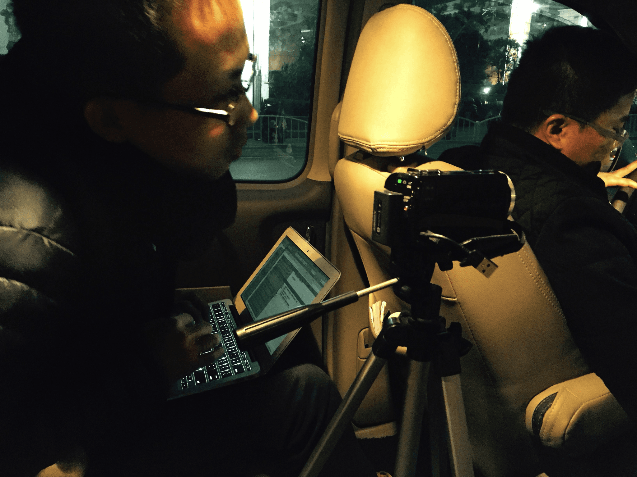
Observe Drivers' Daily Routines
To kickstart the design process, it was crucial to directly engage with our users—drivers—to gain a comprehensive understanding of their needs and identify key pain points in their experience. We engaged drivers directly via interviews (in-car or lab) to understand their needs and pain points. Field research was key for practical insights.
Drivers were frustrated by accepting ride requests.
Drivers frequently made errors in selecting optimal requests (those closest to their location), leading to time-consuming cancellations. This issue was especially critical during rush hour, when drivers had only 2-3 seconds to make a decision.
Rush hours see abundant requests and fierce competition for desirable rides, requiring quick decisions while driving.
Off-peak times involve drivers parking, waiting, and listening to voice messages for suitable requests. Rush hour interfaces are more complex.
Drivers' Priorities: "Get the order fast and safe"
When drivers speak about efficiently and safely obtaining orders, their concerns can be summarized as follows:
Minimizing Phone Interaction
Drivers constantly glance at their phones to extract critical information from new requests, such as distance to their current location, all while potentially driving. They emphasize the need for keywords to be prominently displayed.

Speed and Simplicity
During rush hours, the sheer volume of requests and intense competition for the best rides mean that requests can disappear within seconds. Drivers cannot afford mistakes or multiple operations.
Relevant Requests Only
Drivers have limited time and interest in reviewing requests that are, for instance, 10 km away, especially during rush hour. They expect the system to possess a deeper understanding of their preferences and to only send them relevant requests.
Design Exploration
Through extensive brainstorming and sketching, two core design concepts emerged, addressing the shortcomings of the previous scrolling-list interface. The old design led to numerous driver errors, prompting a shift away from list-based displays. Drivers expressed a need for immediate access to the nearest request to quickly initiate a ride, emphasizing focus and rapid decision-making.
Define the Core Experience
Focus on one thing
Before a new ride, the primary focus is securing the correct quest. For safety, eliminate all distractions while driving.
For a glance
The most crucial information should be prominently displayed on the screen, appearing large and impressive.
Simple and intuitive
Users should be able to accept desired requests with a single touch, and the learning curve should be minimal.
Concept 1: Two Requests in One Screen
Displays multiple requests effectively.
Facilitates faster decision-making through comparison.
Allows refreshing to dismiss current requests.
Utilizes simple gestures.
Concept 2: Focused Single Request
Highlights essential information.
Promotes focus and minimizes distractions.
Extends familiar scrolling habits.
Offers the lowest learning curve.
Strategic Rationale
Clients were initially keen on new solutions but struggled with the strategic decision. The old strategy pushed requests instantly to drivers' phones in a list format. However, research showed drivers' main issues were irrelevant requests and scrolling list usability. Presenting more requests doesn't shorten acceptance times; the key is reducing time to accept new requests.
Why did we choose "Concept 2"?
These following considerations led us to the "one request at a time" solution, a refined version of Concept 2. This decision was made in conjunction with the client's commitment to optimizing their back-end system to deliver more relevant requests.
Precisely Relevant Requests
Ensuring requests are highly pertinent to the driver.
Actionable Information
Providing sufficient and useful data for informed decisions.
Minimized Distraction
Creating an interface free from unnecessary elements.
Enhanced Usability
Designing for intuitive and error-free interaction.
Prioritized Information
The use of indicating colors helps drivers quickly assess whether to delve into details. Crucial information is prominently displayed, and a larger font size enhances readability for drivers and those with impaired vision.
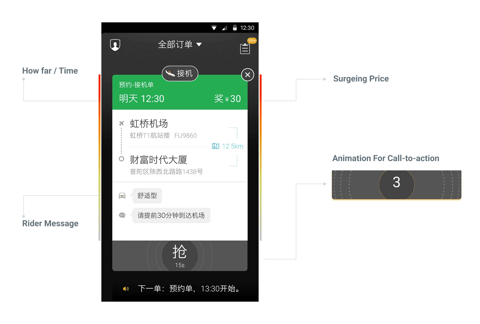
All-in-One
The instant map provides a low-priority, holistic view of the ride's destination. For safety, a simple tap on the entire content area activates the map, particularly beneficial for new users.
Simplicity and Safety
We prioritized the simplest gestures for a driving environment: tapping and swiping left. This design ensures an extremely low learning curve, even for novice users.
Incentive Strategy
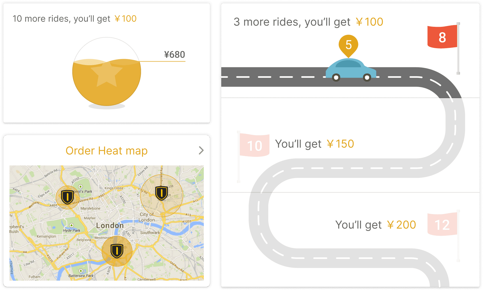
The fierce pricing competition among Kuaidi, Didi, and Uber in attracting drivers proved to be a lose-lose situation. This raises the question: is there a superior approach to driver acquisition and retention? Our competitive analysis revealed that existing strategies primarily involve broadcasting reward tasks. However, many drivers require additional motivation to reach their targets. To address this, we consulted the gaming industry through a focus group.Engaging Challenges
Daily driving can be monotonous. Instead of a straightforward message like, "Complete 12 rides to earn an extra 100 RMB," imagine a daily game task that is both engaging and challenging. For Kuaidi ONE drivers, this transforms work into a fun way to earn money.Progressive Engagement
Upon going offline, drivers will see reward news and a heat map on the homepage each morning, serving as a call to action. After every ride, a pop-up will display task progress, encouraging them to continue. This sense of accomplishment will be particularly helpful in motivating them through the initial, more challenging 50% of the task.Unpredictable Rewards
Inspired by gaming and gambling, we believe uncertainty is a powerful motivator. For every four hours spent online, drivers will have a chance to initiate a "mysterious ride" with the potential for a significant bonus.
Drivers are our partners.
Kuaidi aims to transform the transactional relationship with its drivers into a strong, enduring partnership. Our vision for Kuaidi ONE is "Being a successful partner," which goes beyond simply providing a money-making platform. We strive to offer drivers a pathway to a fulfilling lifestyle, career advancement, and a sense of belonging within a supportive community. To achieve this, we have developed the Partner-growing System and Partner-reward Programme, offering tailored support and guidance based on each driver's level.

What I Learned
The daily brief serves as a crucial tool in achieving this balance. It facilitates shared understanding by disseminating information and insights, ensuring everyone operates from the same knowledge base. More importantly, it encourages team members to step outside their individual silos, providing an opportunity to vocalize challenges.
Often, what appears to be a problem in isolation may not be when viewed from a broader, more holistic perspective. This brief, typically lasting just 15 minutes, is essential for a quick design check, ensuring the team remains on the right track. To maintain objectivity, we rely on our collaboratively developed principles, strategies, personas, and scenarios as a guiding framework for alignment.

