
Strategic redesign of the Mary Kay online ordering platform
Mary Kay is a global leader in direct-selling cosmetics, and this platform is the primary business tool for its vast network of Independent Beauty Consultants. The existing platform, built on legacy technology, was hindering their ability to efficiently manage their business.
My Role and Responsibilities
Role
Senior Product Designer
Time
April. 2013 - Oct. 2013 (6 Months)
As the Senior Product Designer on this project, I was responsible for the end-to-end user experience. My key responsibilities included facilitating workshop, mapping user flows, creating wireframes and high-fidelity interactive prototypes, and collaborating with developers to ensure a high-quality final product.
Senior UI Designer
Jie, Li
Design Director
Wei, Cao
UX Researcher
Huimin, Shi
Product Owner
Frankie (Mary Kay)
Product Manager
Eric (Mary Kay)
Front-end Engineer
Donghan,Yu
Business Owner
Hanchen, Lin
Design Consultant
Nick, Lau & Qin, Lin
Project Goals
The goal of this project was to modernize the outdated interface and streamline the complex ordering process, empowering consultants to save time, increase sales, and feel proud of the brand they represent.
Problems to solve
The research allowed us to define the core problems with precision. The platform was failing its users in four critical ways:
An Inefficient Ordering Process:
The existing flow was slow and confusing, especially for the bulk orders that consultants frequently place.
An Outdated User Interface:
The visual design did not reflect Mary Kay's premium brand identity, creating a poor impression.
A Poor Mobile Experience:
The lack of a responsive design made ordering on the go nearly impossible.
Difficult Product Discovery:
A cluttered layout and weak search functionality made it hard for consultants to quickly find products.
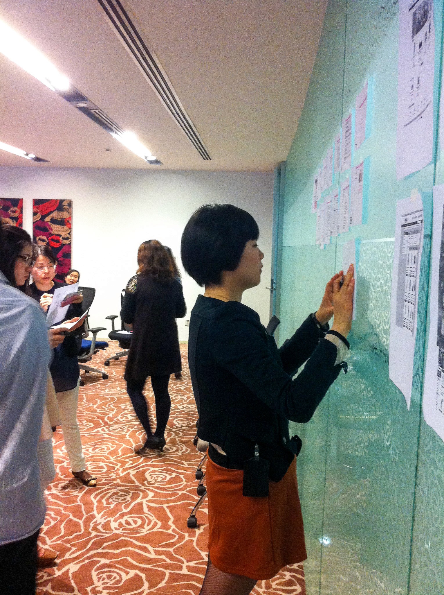
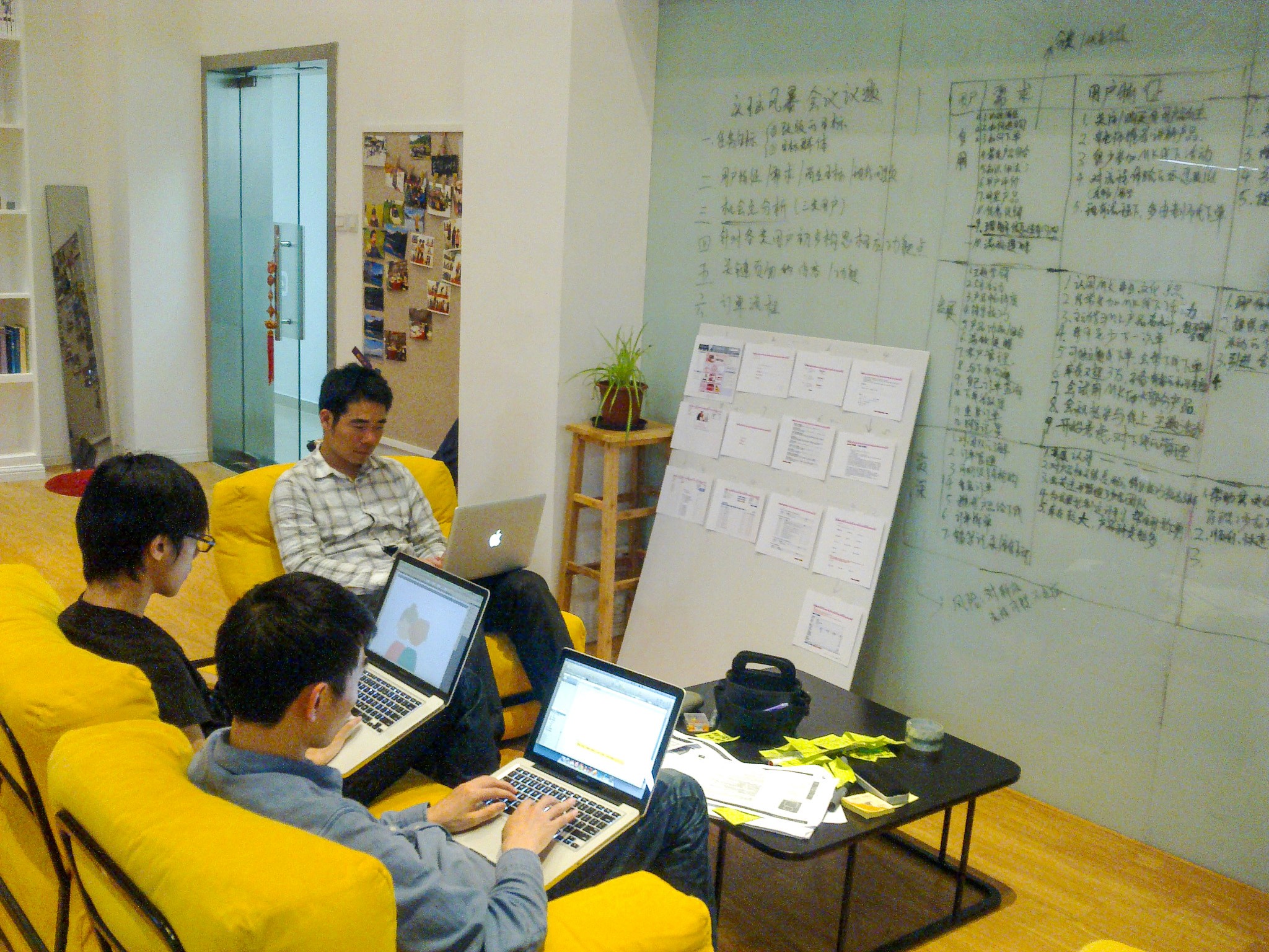
A Hybrid & Collaborative Approach
Our team rigorously adopted a User-Centered Design (UCD) approach, an iterative framework that places the needs and limitations of end-users at the center of every decision. Our process followed four key phases:
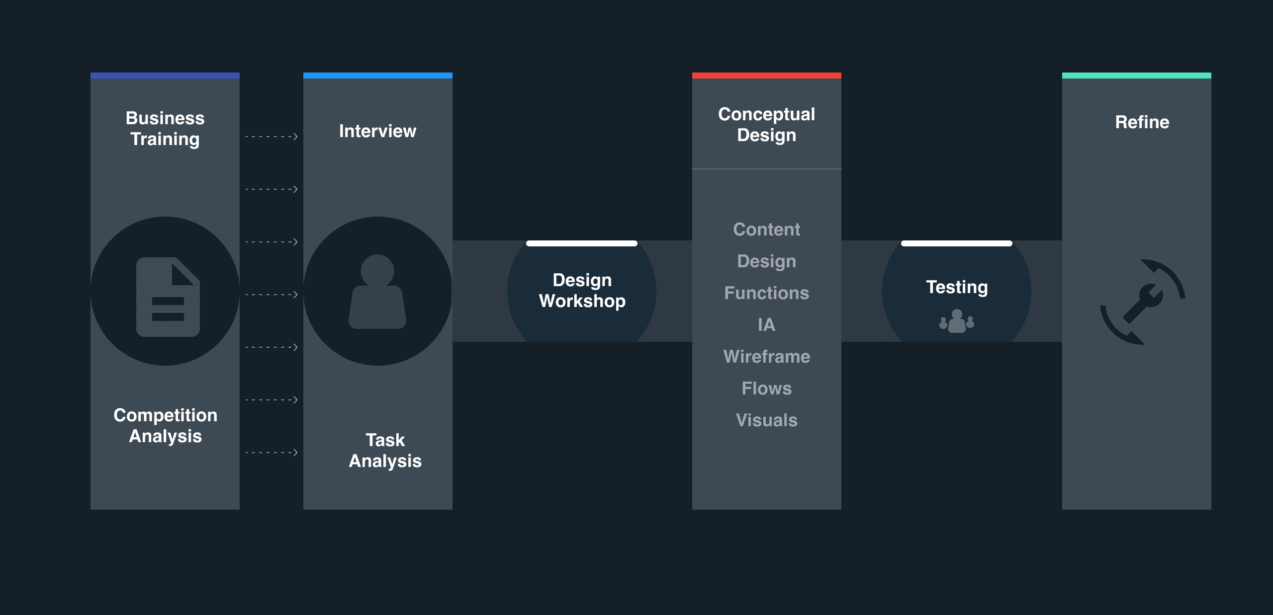
Building Foundational Domain Knowledge
Our discovery phase began with building a deep understanding of the business from both an internal and external perspective.
Recognizing that deep domain knowledge was essential for asking the right questions, we initiated a business training session with the Mary Kay Product Team. Learning their unique direct-selling model and terminology was invaluable, providing the foundation for our initial user segmentation and the core hypotheses that guided our research phase.
In parallel, we conducted stakeholder interviews to clarify key business goals and success metrics, and performed a competitive analysis of leading e-commerce platforms to identify industry best practices. This multi-pronged approach ensured our subsequent design work would be grounded in a solid understanding of the business context, user needs, and market landscape.


User Interviews & Task Analysis
To gain deep, qualitative insights beyond what standard usability testing could offer, we conducted a two-part research session with our Beauty Consultants.
In-Depth Interviews
First, we held in-depth interviews to build a holistic understanding of their broader context, including their daily workflows, motivations as business owners, and overall challenges.
Contextual Task Analysis
Next, we had participants perform real ordering tasks on the existing platform using the "thinking aloud" protocol. This allowed us to observe their organic behaviors in real-time and pinpoint the specific usability issues and pain points that were causing the most friction.

Understanding the Modern Beauty Consultant
To capture these evolving needs, we synthesized our research into three core personas. These personas became our guide, ensuring that every design decision was grounded in the real-world context of the consultants we aimed to empower.
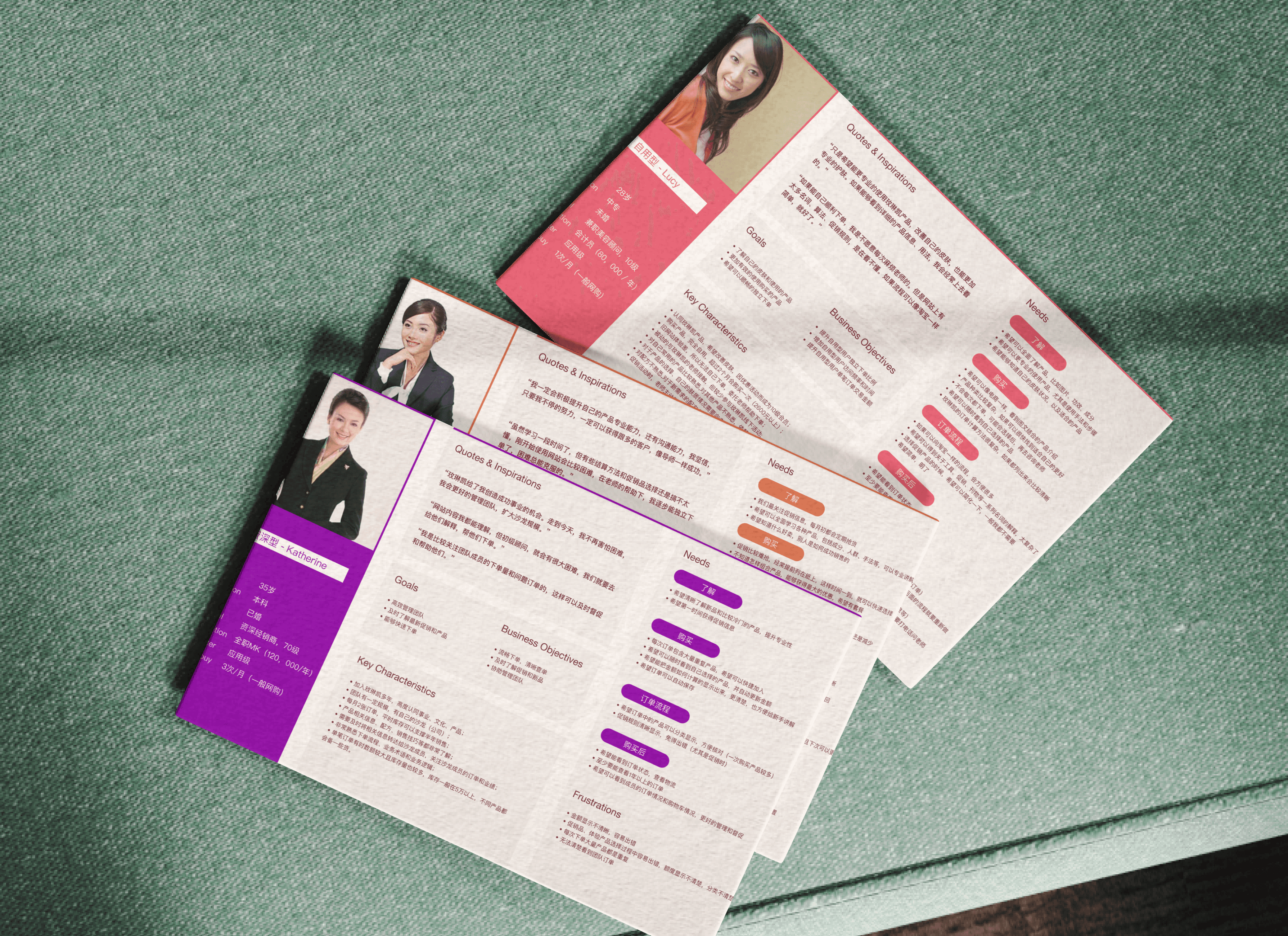
The New Consultant: behaves like a regular consumer
Who they are: A new customer, often with a weak relationship with the brand, who places an order for personal use every couple of months. They typically only know the products they personally buy and find the old website difficult to use.
Primary Goal: To improve their skin by learning to use products effectively and to be able to place their own orders without assistance.
The Intermediate Consultant: Actively developing other new consultants
Who they are: A consultant with a strong relationship with Mary Kay and a small team. They place a large order monthly but have problems with the ordering process and struggle with the complexities of calculating prices.
Primary Goal: To become a product expert, learn more effective sales skills, and grow their business by developing new consultants.
The Distributor: Leadership and Mentorship
Who they are: An expert business owner with a large team or even her own salon. She knows the products and business regulations in detail and places multiple large orders every month with few issues.
Primary Goal: To scale her business by selling more, developing her team, and managing her large organization more effectively.
Mapping the User Journey
With our personas established, the next step was to map out their end-to-end experience. We created a User Journey Mapthat detailed the concrete story of a Beauty Consultant's process: from making a sales plan and choosing products, to placing and managing an order. By mapping out all the scenarios and touchpoints, we were able to identify requirements within a real-world context and confirm our initial assumption: simply fixing individual pain points was not enough.
A Guiding Principle: A Platform That Grows with the User
A key insight from our research was that our personas represented different career states that a single consultant could evolve through over time. We found that the needs of more advanced users, like Distributors, typically encompassed the needs of novices, like Self-use Customers.
This led to our core design principle: the platform must be a dynamic tool that grows with the consultant's career. It needed to be simple for a new consultant learning about products, but also adapt to provide the business management tools a high-level Distributor needs. This approach ensures the platform is a long-term partner in their professional growth.
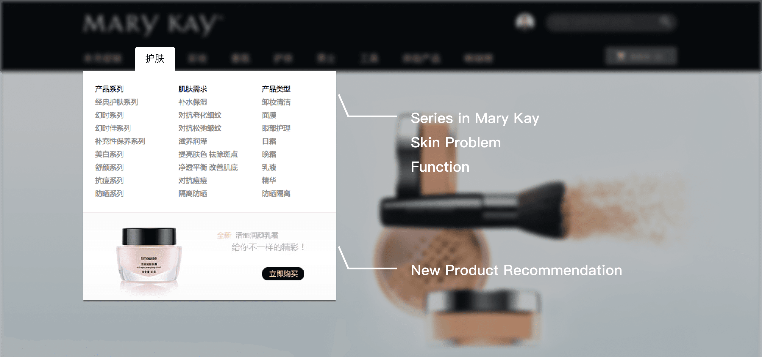
Intuitive Product Discovery for All User Levels
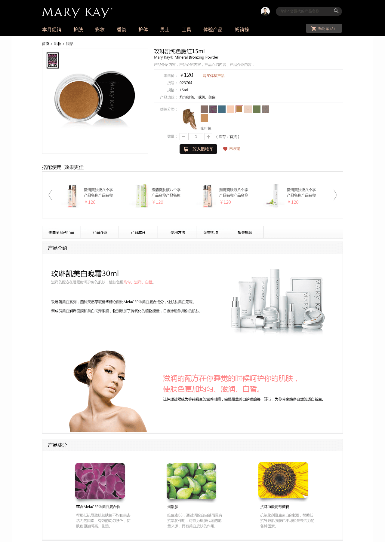
We recognized that first-time users think about cosmetics in terms of their needs (e.g., "solving a skin problem"), while expert consultants know the specific Mary Kay product lines by name. To serve both, we reconstructed the product search and navigation.
We introduced new, intuitive categories like "Shop by Skin Problem" and "Shop by Function" to lower the learning curve for new users. For our advanced consultants, the familiar "Shop by Series" navigation remains the primary option. This approach respects the mental models of all our user personas, making the experience feel familiar and easy from the start.
"Quickbuy" for Expert Efficiency
Our research showed that intermediate and advanced consultants are focused on speed. They already know what they want and need to place orders as efficiently as possible. To support this, we introduced a "Quickbuy" feature, allowing them to add products directly to their cart from the category page, bypassing the need to visit each detail page individually.
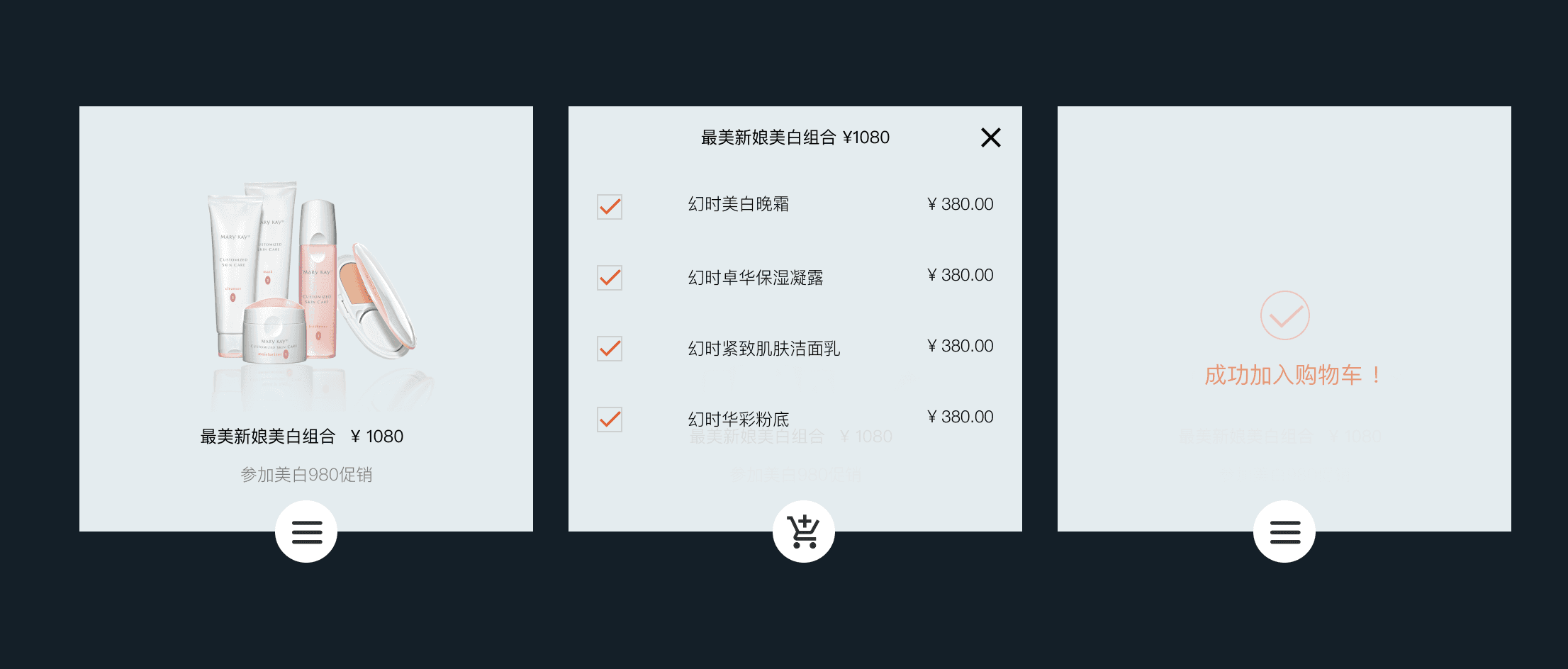
For complex promotional items like cosmetic "suits," we designed an elegant "flip-over" animation that expands the product card to show bundled items without taking the user away from their primary task.
Streamlined "Batch Order" for Distributors
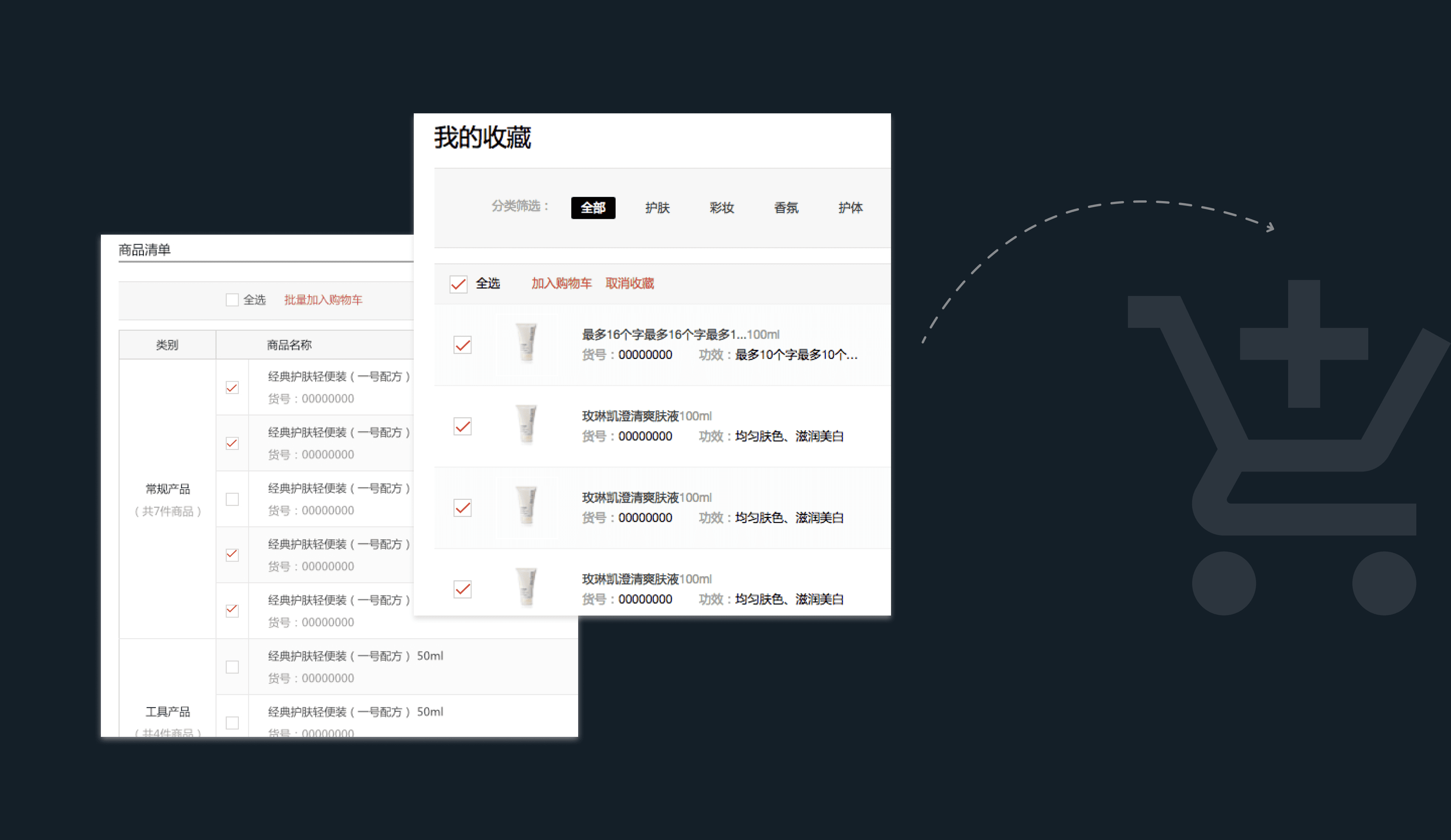
From our interviews, we learned that top-level Distributors often place similar, large orders every month. To solve this pain point, I designed a "Batch Order" feature to save them significant time and effort. Consultants can now build a template of their regularly purchased products or simply re-order from their purchase history with a single click.
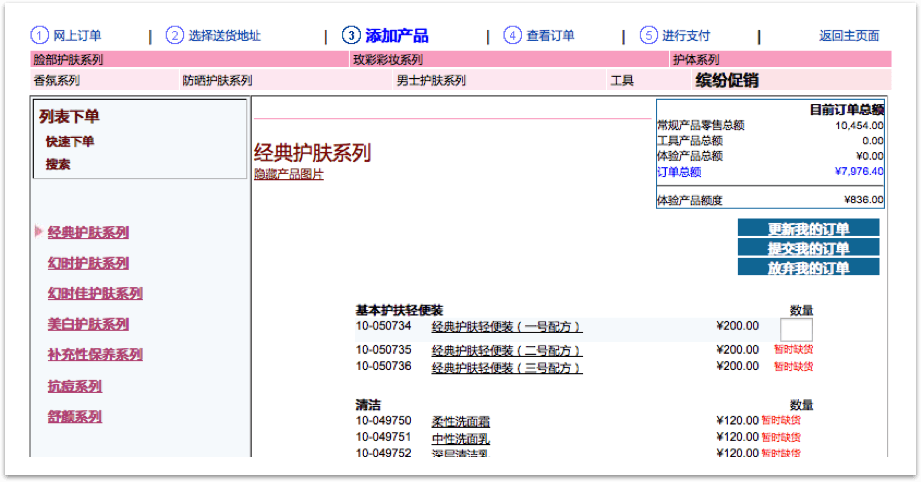
A Transparent & Reassuring Checkout Process
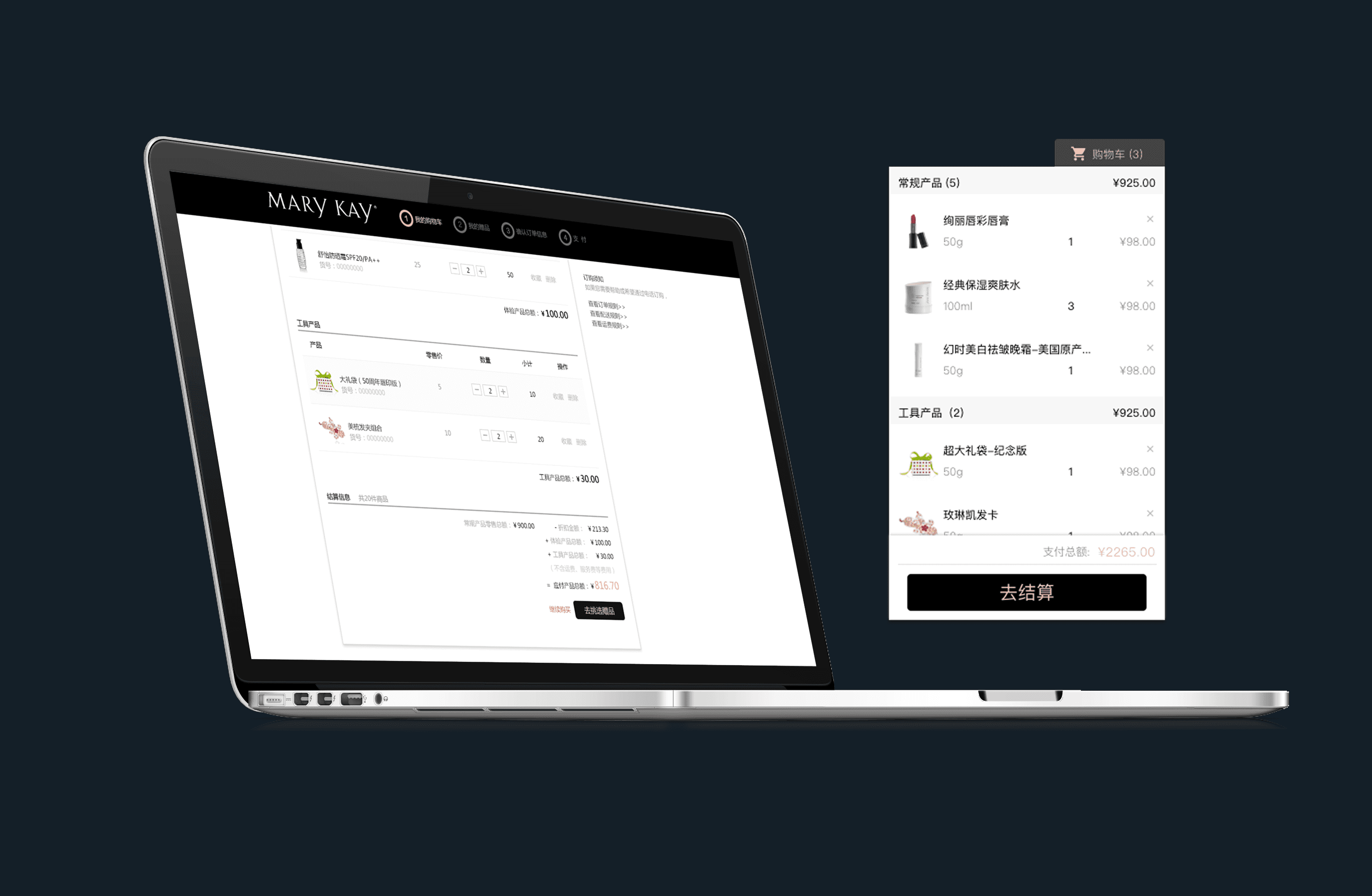
For beginners, the complex Mary Kay pricing and discount system was a major source of confusion. To solve this, we designed a floating cart that allows users to easily check their purchase details at any time. Inside the cart, we provided a clear, automated breakdown of charges for different product types (General, Tools, Samples), eliminating the need for manual, off-screen calculations and building user trust in the system.
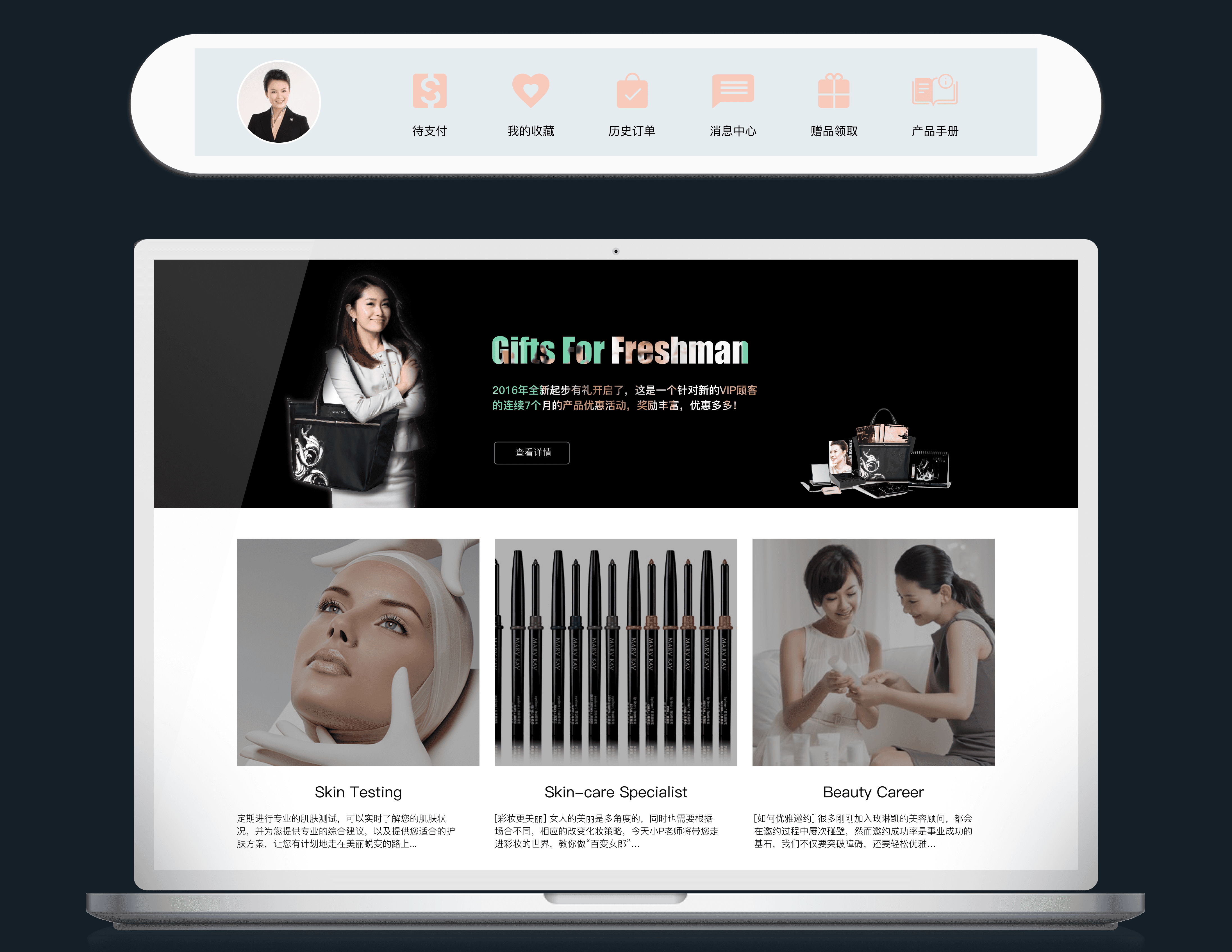
A Personalized & Dynamic Platform Experience
A core principle of our redesign was that the platform should be smart enough to grow with the user. Because every consultant must sign in, we leveraged their career level to deliver a personalized experience. For example, a new consultant at Level 1 sees a "Gifts for Freshman" promotional banner, while a Level 10 Distributor sees content and tools relevant to team management. This ensures the content is always relevant, supportive, and helps each consultant feel that the platform is their personal business partner.
Key Learnings & Reflections
This project was a significant learning experience that reinforced the importance of both our process and our deliverables. Two key reflections stand out:
1. Use Low-Fidelity Prototypes to Unlock Better Feedback
We learned that interviewing users about an existing, flawed product can limit their feedback. In the future, I will introduce simple paper prototypes during initial research to help users think beyond current constraints and provide more forward-thinking, concrete requirements.
2. Visualize Research to Maximize Stakeholder Impact
A detailed, 100-page research document proved ineffective for communicating findings to busy stakeholders. I learned that research insights must be presented in a scannable, visual format. For future projects, I will ensure designers help visualize our research to make the data more engaging and impactful.
The Impact: A 30% Increase in User Satisfaction
Following the launch, post-release surveys indicated that the user satisfaction score for the new platform increased by 30% compared to the old version. This significant lift demonstrated that the new, user-centered design directly addressed the key pain points of the Beauty Consultants.
Stakeholder Recognition
Frankie
IT Leader, Mary Kay China.
"The new design provides a holistically consistent service solution for all Beauty Consultants, not just a focus on the ordering process. The work is professional."
Eric
Project Manager, Mary Kay China.
"The executives at our U.S. headquarters are very satisfied with the new design. There is strong potential to apply this new design to other global affiliates."
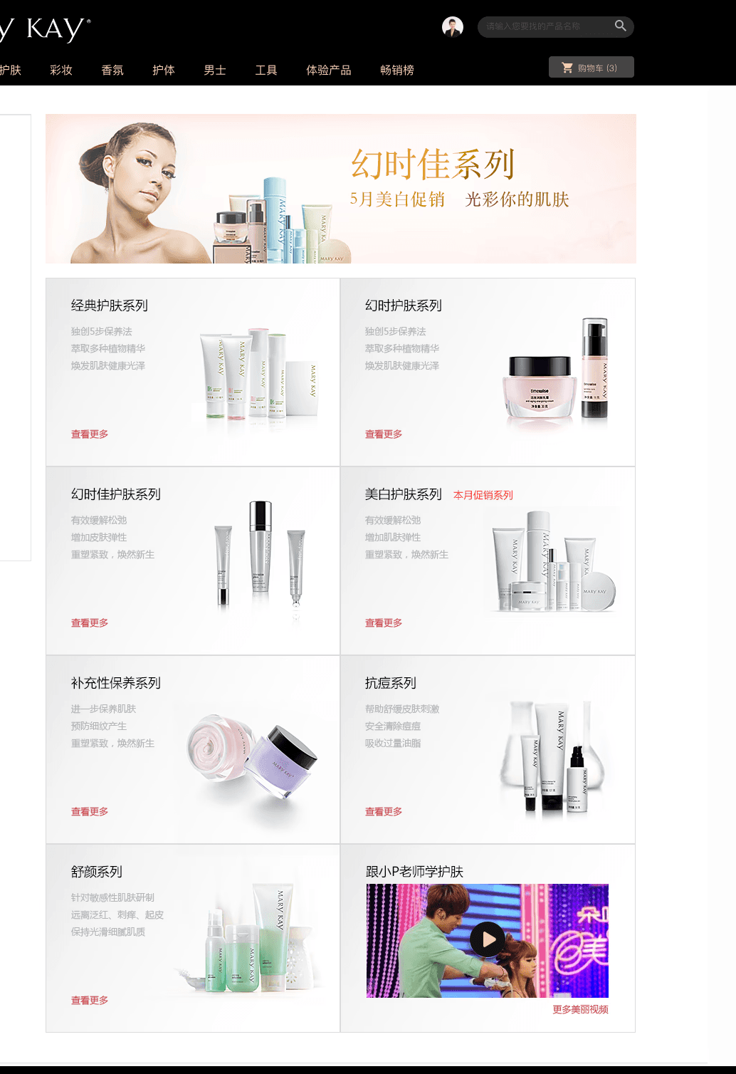
The Visual Design: Creating a Modern & Professional Experience
A key goal of the redesign was to create a modern, premium digital experience that aligns with Mary Kay's prestigious brand identity. The new visual design system was built on a foundation of clarity, consistency, and sophistication to create a tool that Beauty Consultants would be proud to use.

Home page
Product details
Browse category